Controls
The second step in creating a configurator is to build the form using controls.
Controls define the input fields that users interact with. Each control sets or modifies a variable that is later used in calculations and logic.
Control Fields
Each control can be configured with the following options:
Basic Properties
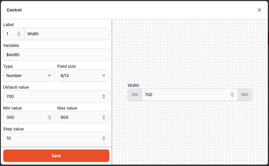
Label
Display name of the field shown to the user (e.g., "Width", "Type").Variable
Internal name of the variable. Must start with$and can include letters, digits, and underscores (e.g.,$width,$material_type). This variable will be available in calculations.Type
The type of input field. Available types:Text– a single-line text inputTextarea– a multi-line text inputNumber– numeric input (supports decimals)Select– dropdown list of selectable options
Field Size
Width of the field in grid columns (e.g., 6/12). Used to control layout and allows arranging fields into responsive layouts.
Number Type Configuration
For Number type controls, you can configure:
Default Value
A default value that will be pre-filled in the control field (e.g., 700).Min Value
Minimum allowed value (e.g., 350).Max Value
Maximum allowed value (e.g., 900).Step Value
The increment/decrement step when using arrow buttons (e.g., 10).
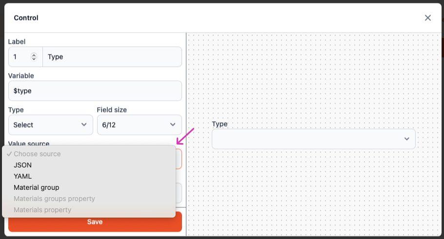
Select Type Configuration
For Select type controls, you need to configure the Value Source:
- Value Source
Defines where the options in the dropdown come from:YAML– manually entered values in YAML formatJSON– manually entered values in JSON formatMaterial group– generates a list of materials from a selected groupMaterials groups property– uses a specified property from materials in a selected groupMaterials property– uses a property from a specific selected material
Value Source Options
Depending on the selected Value Source, additional fields become available:
Material Group
Required if Value Source isMaterial group. Specifies from which group to take materials.Group Property
Required if Value Source isMaterials groups property. Specifies which property to extract from each material in the group.Material Property
Required if Value Source isMaterials property. Specifies which property to use from the selected material.YAML / JSON
Required if Value Source isYAMLorJSON. Specifies the list of available values manually.
Manual Value Entry Examples
YAML format:
- Oak
- Birch
- Pine
- Maple
JSON format:
[
  "Oak",
  "Birch",
  "Pine",
  "Maple"
]
Usage Tips
Variable Naming: Use descriptive variable names that clearly indicate their purpose (e.g.,
$board_widthinstead of$w).Layout Planning: Use field sizes strategically to create intuitive form layouts. Consider grouping related fields together.
Default Values: Set sensible default values to improve user experience and reduce the need for manual input.
Value Sources: Choose the appropriate value source based on your data structure. Use material-based sources for dynamic content that may change over time.
Validation: Always set appropriate min/max values for number inputs to prevent invalid configurations.